The complete guide to email accessibility

Perfecting your email flow and ensuring your emails hit the inbox are the ultimate goals when it comes to email delivery. But success in these two aspects won’t amount to as much if your emails aren’t accessible to all recipients.
And according to a report by the Email Markup Consortium, 99.97% of emails tested contained accessibility issues categorized as serious or critical, so it's likely that we could all make some improvements.
Ensuring email accessibility will improve your user experience and customer journey, and will result in more of the desired actions being taken from your emails. Let’s take a look at the technical and content-based best practices you can follow to create accessible emails.
What is email accessibility and why is it important?
Email accessibility enables all people to receive, understand and engage with your message, regardless of their ability, disability, or use of any assistive technology. It’s about making your emails adaptable to each recipient’s individual needs on a mass scale.
It sounds tricky—and it does take some work—but it’s important because:
It makes your brand more inclusive—it’s the right thing to do!
It improves the user experience
It boosts engagement and conversions
What’s more, it’s estimated that 1 in 6 people across the globe—that’s 1.3 billion—experience significant disability and at least 2.2 billion people have vision impairment. Those are huge numbers and failing to make your emails accessible means that a large proportion of your recipients could be missing out on your messages.
Email accessibility standards
There are two sets of regulations that should be taken into consideration for accessibility: the Americans with Disabilities Act (ADA) and the Web Content Accessibility Guidelines (WCAG).
While the ADA and its regulations were put into effect long before the internet became a primary component of society, a specific title prohibiting businesses from “discriminating on the basis of disability in places of public accommodation” can be extended to email.
They offer no guidelines or standards for this but that’s where the WCAG comes in. The WCAG was created by the Worldwide Web Consortium (W3C) and offers comprehensive guidelines on how you can make your emails, among other things, meet their accessibility standards.
Email accessibility guidelines: POUR
Accessibility guidelines follow 4 guiding principles: Perceivable, Operable, Understandable, and Robust—POUR.
Perceivable refers to the capacity for users to recognize content and interface elements through their senses. For some, this primarily involves visual perception, while for others, it may involve auditory or tactile senses.
Operable refers to users' ability to effectively utilize controls, buttons, navigation, and other interactive features. This often involves employing assistive technologies such as voice recognition, keyboards, and screen readers for many users.
Understandable refers to users’ ability to comprehend the content, learn, and retain knowledge on how to utilize your resources. Consistency in presentation and format, predictability in design and usage patterns, and suitability of voice and tone to the audience are essential aspects to ensure comprehensibility and memorability.
Robust refers to ensuring that content can be reliably interpreted by a diverse range of users, enabling them to select the technology through which they access, understand, and engage with your emails. Users should have the freedom to choose their preferred technologies.
Guidelines for perceivable email accessibility
1. Make all content readable
Visually impaired recipients or any recipients using assistive technology need all email content to be understandable by the technology they use. This means that you should provide text alternatives for images, icons and any other non-text content that is pertinent to the message.
You can do this with image alt text. The alt attribute allows you to add a text description to images in your email and it’s also essential for when recipients are using email clients that block images. Best practices dictate that alt text should be descriptive but brief.
Let’s use this example of an image of an astronaut. Good alt text for this would be:
A NASA astronaut in front of a space station working on the Hubble Space Telescope.

Assistive technology is able to easily understand this alt text and at the same time, it is descriptive enough for us to understand what the image shows.
Keep in mind that not all visual elements in your emails may need descriptive alt text. If the image is purely decorative, and doesn’t add value to the resource or information, you can simply add the value of null to the alt attribute, so that assistive readers know they can skip it. This will also help to improve the experience by cutting out any unnecessary description.
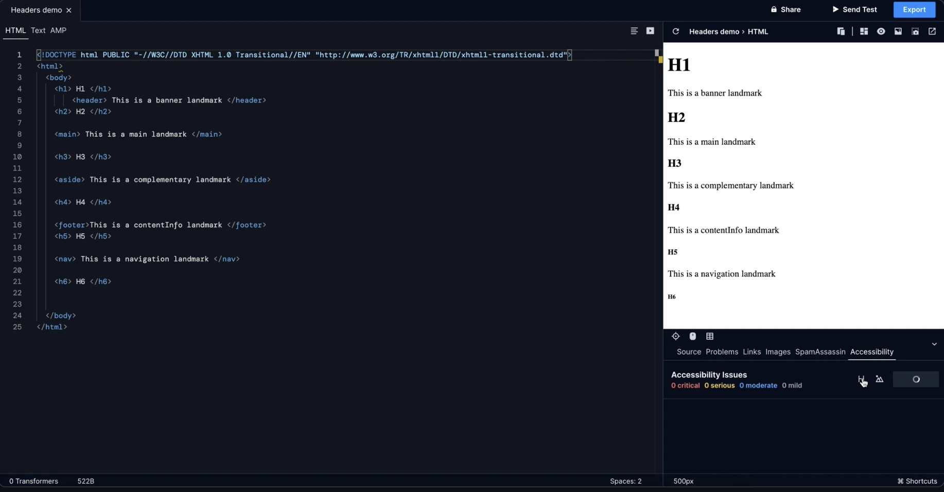
2. Use appropriate tags for structure and markup
A lot of accessibility best practices relate to the design of the email. However, there are also important considerations when it comes to the way your emails are coded.
Using semantic HTML elements adds meaning to your code, allowing assistive technology to better understand the structure of your emails in relation to the content by accurately describing each element.
Some simple examples of HTML tags you should use in your emails are the h1, h2, h3, etc. tags, the p tag, and ul tag. It’s important to use semantic tags in the way they are intended to ensure maximum accessibility. For example, you should only use the blockquote tag to highlight quotes within your email, and not for styling purposes.
Here’s a list of semantic HTML tags you might use in your emails:
Tag | Description |
<article> | Defines independent, self-contained content. |
<aside> | Defines sidebar content. |
<blockquote> | Define a block of text quoted from another source. |
<details> | Defines additional information that can be toggled on or off. |
<em> | Puts emphasis on a word or group of words. |
<figure> | Defines self-contained media content such as illustrations or photos. |
<figcaption> | Defines a caption for a <figure> element. |
<footer> | Specifies the footer section. |
<h1>, <h2>, <h3>, etc. | Defines the headings with hierarchy. |
<header> | Specifies the header section. |
<main> | Defines the main content of the email. |
<mark> | Specifies highlighted text that is of importance. |
<nav> | Defines navigation links. |
<p> | Defines paragraphs within the content. |
<section> | Defines a standalone section in the email. |
<strong> | Puts strong importance on a word or group of words. |
<summary> | Defines a visible heading within the <details> element. |
<time> | Specifies a date/time. |
<ul>, <ol> | Defines a list. |
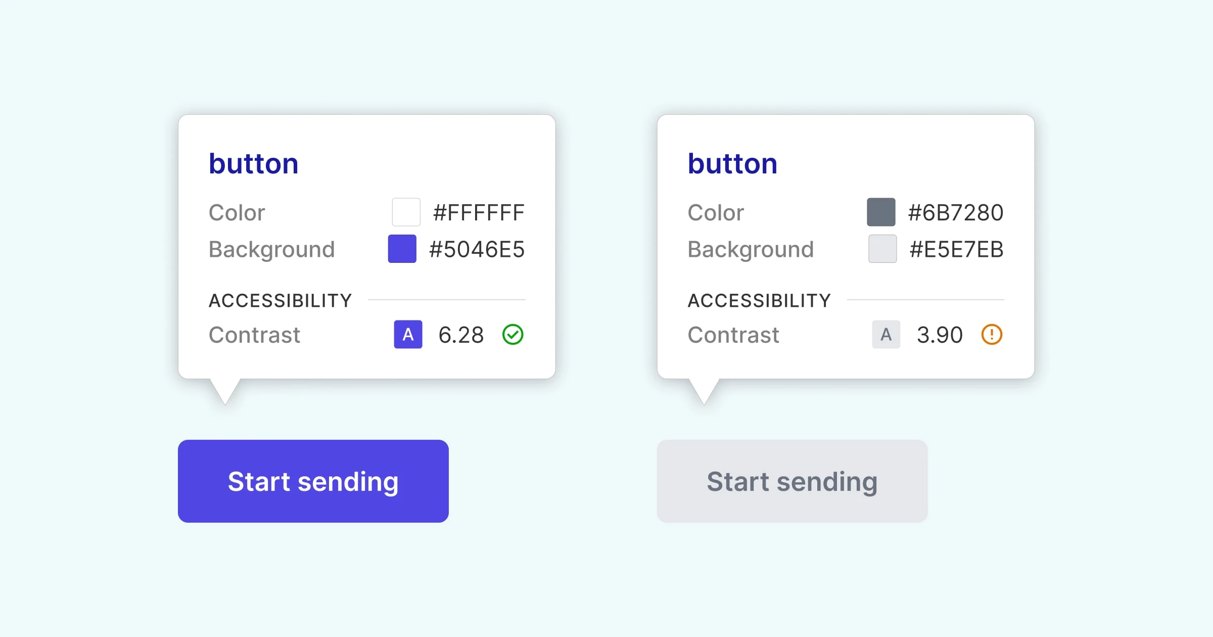
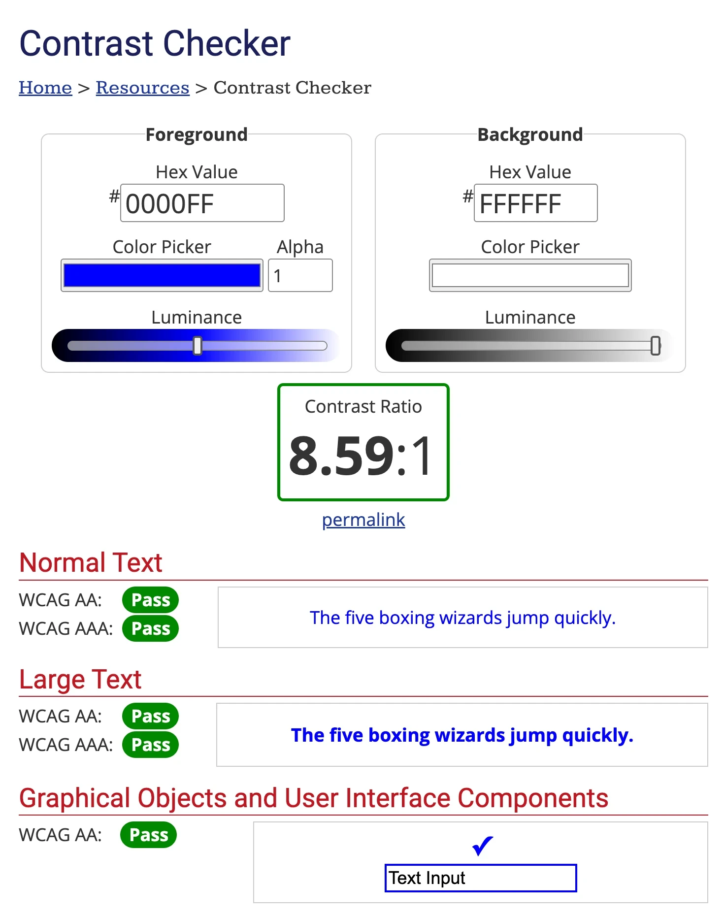
3. Use good color contrast
It’s estimated that there are 300 million people around the world with color vision deficiency and low-contrast text makes it more difficult for these people to read content formatted in this way.
For the maximum level of accessibility, the color contrast between text and background should be 7:1, 4.5:1 for large text, and 3:1 with surrounding text and underlining for links. You can use a color contrast checker like this one from WebAIM.org to check your contrast ratios and make adjustments.
Here is an example of good and bad text and background contrast for a button.
4. Make emails responsive and support reflow
Reflow is the action of rearranging the text in an email to match the recipient’s viewport, which may change depending on the user’s browser, device, and preferences.
To meet WCAG standards, your email content must be presented without loss of functionality or information and without the need to scroll horizontally—check out the exact WCAG specifications. Put plainly, your emails need to be responsive across a range of browsers, mobile devices, screens, and email clients.
If you use any pre-built MailerSend templates or create your templates in any of our builders, responsiveness will be taken care of automatically.
5. Avoid using images in place of text
Text included in images can’t be read by screen readers or other assistive devices. What’s more, some recipients choose to use email clients that do not display images, or choose to have images disabled.
In these cases, any content displayed as text in an image will be lost. So, if the information is important to the message, it should be included as text and not as an image. An exception to this would be a brand name or logo.
Image-only emails also:
Can’t be translated
Don’t allow for text to be copied
May result in small, unreadable text as images are automatically resized for different devices
Don’t allow for keywords to be searchable in the recipient’s inbox
6. Use sufficient text spacing
Tightly packed text is generally more difficult to read and track and can be even more difficult for recipients with cognitive or visual impairment. Set sufficient spacing for line height, paragraph spacing, letter spacing, and word spacing. You should also make use of padding to ensure there is a decent amount of whitespace around the edges of your emails.
WCAG guidelines suggest:
Line height (line spacing) to at least 1.5 times the font size;
Spacing following paragraphs to at least 2 times the font size;
Letter spacing (tracking) to at least 0.12 times the font size;
Word spacing to at least 0.16 times the font size.
7. Align text to one side—avoid justifying copy
Justified text can be visually appealing but it creates uneven spaces between letters and words which can make text difficult to read for neurodiverse recipients such as those with dyslexia. Left-aligned text can also be much easier to follow for visually impaired readers, as they use the edge of the text as a guide.
8. Avoid using only color to convey meaning
Color is used in many situations to signal some kind of message or meaning: Red=Stop/Bad, Green=Go/Good, for example. But when a recipient or their chosen assistive technology is unable to interpret the color or message it conveys, it has no meaning at all.
It’s best to keep all important messaging to text, but if you do use color, make sure that the message is still clear to recipients who are unable to gather meaning from colors. Think about pedestrian crossings—while they use green and red lights to signal whether it’s safe to cross, they also use auditory signals for those who are unable to interpret them.
Guidelines for operable email accessibility
1. Use descriptive subject lines and preheaders
Similar in how the <title> tag for webpages helps users to find and navigate content, subject lines and preheaders also help recipients to locate the emails they are looking for, determine the importance or interest in the content, and orient themselves when the email is open.
While it might be tempting to use abstract, witty subject lines, the clearer and more understandable you make them, the more accessible they will be for the majority of recipients. They’ll also be much easier to search for later on.
2. Use descriptive link text and CTAs
If a recipient—whether using assistive technology or not, but particularly if they are—wants to scan through your email for the links and CTAs, text such as “click here” or “this page” won’t be much use to them. They should be able to understand where the link will take them without having to read much, if any, of the text around it.
Wherever possible you should make your link anchor text descriptive of the link destination. For example, if I want to link to a page about the Hubble Space Telescope, I could use the anchor text “Learn about the Hubble Space Telescope”. However, the WCAG does also include non-descriptive links preceded by descriptive text in its success criteria. For example, “To learn more about the Hubble Space Telescope, click here”.
3. Organize content with descriptive headings
Just as the subject line and preheader allow readers to find and determine the importance of an email in their inbox, headings in emails help them understand the structure and importance of the content in the message.
Using descriptive headings makes it much easier for the reader to skim your email and jump to the sections that are relevant or interesting to them, without having to dive into the content. Here’s an example of some headings and how they can be made more descriptive:
Usage becomes Your [product name] usage for April
Updates becomes April’s product updates
New comments becomes Latest comments on [thread/article name]
And, as mentioned previously, you should use the appropriate <h> tags to denote importance or create structure. Example:
<h2>April updates</h2>
<h3>Product updates</h3>
<h3>Company updates</h3>
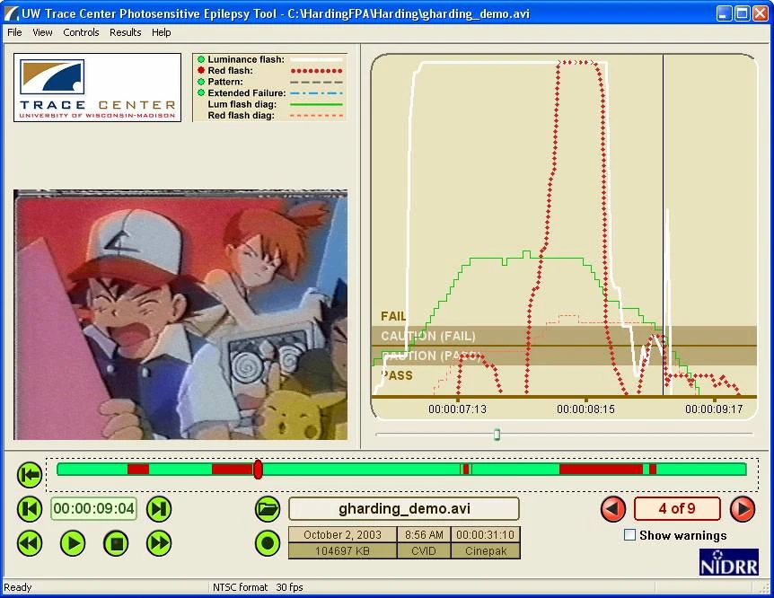
4. Avoid using flashing content
While a flashing GIF may be harmless to some, it can cause photo-sensitive seizures in others. To be on the safe side, it’s best to avoid sending flashing images or links to flashing content altogether.
But if your email calls for it, the WCAG suggests keeping flashes to below 3 per second to remain accessible. You can use this free photosensitive epilepsy analysis tool from the University of Maryland to test before you send.
5. Include a plain text version of the email
Since plain text doesn’t support semantic HTML tags, we don’t suggest that you only send a plain text email. But sending a plain text version of your email along with the HTML version will ensure the largest group of recipients possible will be able to receive it. It will allow recipients who view their emails on a client or device that blocks HTML emails to still access your message.
With MailerSend, whenever you create an HTML email with one of the builders, a plain text email will automatically be created and sent as well.
Guidelines for understandable email accessibility
1. Define the default language of your email
This involves adding the HTML language attribute to your emails so that assistive technology can easily identify the default language of your message. There are a few reasons why setting the language is important for accessibility, including:
It allows multi-language speech synthesizers to understand what the intended language is and adapt to its specific pronunciation and syntax
It assists braille translation software in using the appropriate control codes for accented characters and inserting the control codes that are necessary to prevent errors
It assists mail clients in providing definitions using a dictionary
You can set your email’s language by adding the language attribute in your email header:
<html lang=”fr”>2. Make email copy readable
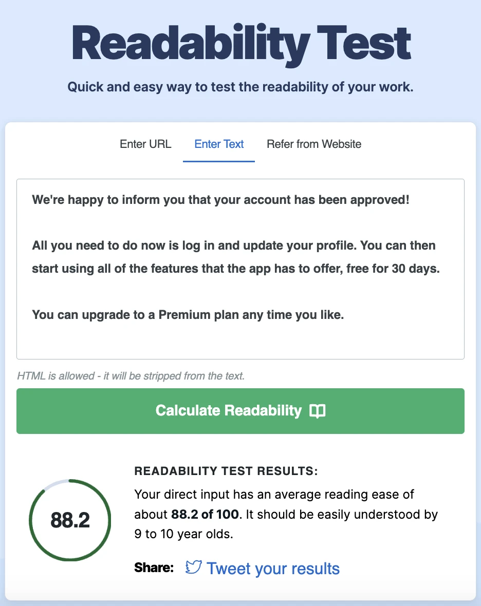
Readability is all about how easy it is for a piece of text to be read and understood by its audience. It’s impacted by numerous factors such as the vocabulary you use, sentence structure, coherence, and overall clarity. The text should be able to convey its message without any confusion or difficulty in understanding it.
The easiest and most popular way to gauge the reading level of your emails is to use the Flesch-Kincaid Reading Ease test. You’ll likely be familiar with this—it’s employed by many apps and tools, like Microsoft Word or Clearscope, and calculates how easy your text is to read on a scale of 0-100.
100-90 | 5th grade—very easy to read, easily understood by an average 11-year-old |
90-80 | 6th grade—easy to read, conversational English for consumers |
80-70 | 7th grade—fairly easy to read |
70-60 | 8th-9th grade—easily understood by 13- to 15-year-old students. |
60-50 | 10th-12th grade—fairly difficult to read |
50-30 | College—difficult to read |
30-10 | College graduate—very difficult to read, best understood by university graduates |
10-0 | Professional—extremely difficult to read, best understood by university graduates |
For emails aimed at a general audience, it’s recommended that readability doesn’t exceed 7th-8th grade, or a score of 60-80. At this level, 85% of the public would be able to read your email.
If you’re unsure about the readability of your emails, you can use this free readability test to find out.
3. Avoid non-standard language and abbreviations
Slang, jargon, idioms and abbreviations can definitely add fun and personality to your emails, but they might not be interpreted or understood by everyone in the same way. So it’s better to stick to clear, easy-to-understand, standard language.
This is especially true for transactional emails that often contain important information or require the recipient to complete an action. It’s crucial for the message to be clear and quickly understood—you don’t want to leave recipients confused about what they should do or spend time trying to decipher your message.
If you do find yourself using unusual words or abbreviations, be sure to include their definitions or explanations.
4. Be consistent with your support information
The recipients of your transactional emails are users or customers of your product or service and that means they might need help from time to time. Make help easy for them to access by including a clear, easy-to-locate link to your support channels in your emails, and ensuring the links are consistent across all email templates.
In MailerSend, you can easily create a branded email footer and include it in all of your email templates.
Ensuring robust email accessibility
The robust principle relates to the responsiveness of your content and dictates that it must be robust enough to be interpreted by a wide variety of devices, clients and assistive technologies.
To meet the criteria for this guideline, maximize the compatibility of your content—including your emails and any downloadable attachments.
Tools you can use for accessibility testing
VoiceOver
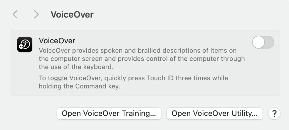
VoiceOver is a screenreader built into Mac devices. It reads page content and semantic information out loud and can be used to test screenreader accessibility for your emails.
AssistivLabs
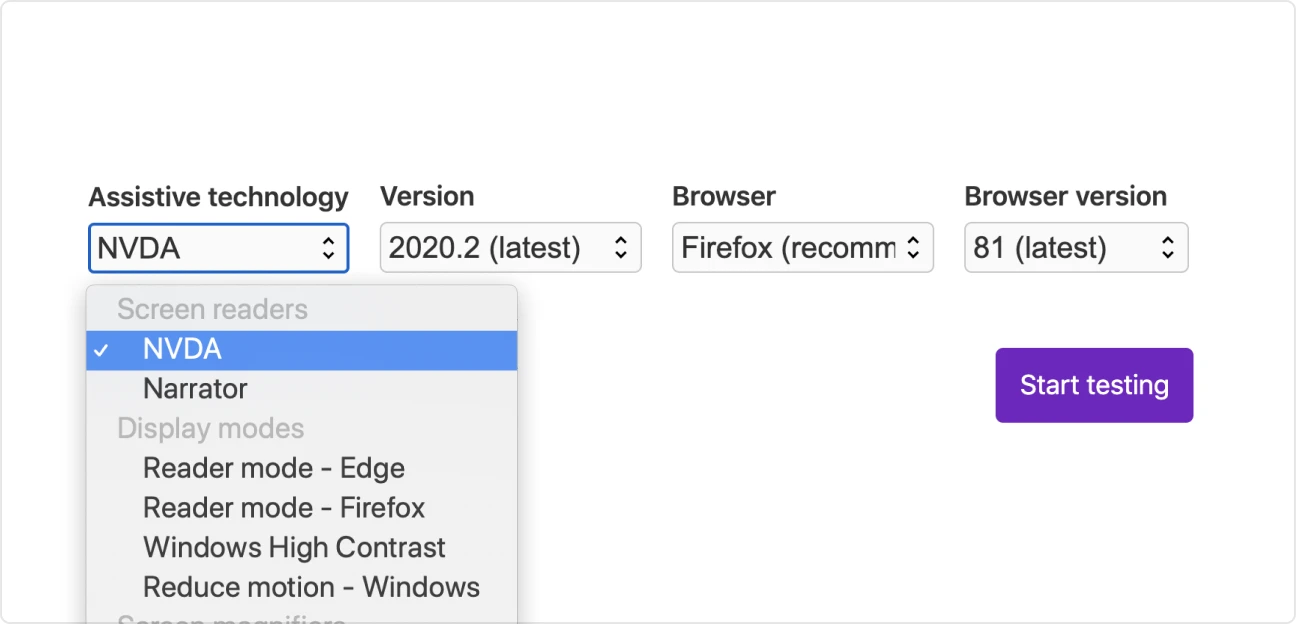
AssistivLabs allows you to test multiple elements: screenreader accessibility, contrast, and screen magnifiers.
WebAIM Contrast Checker
WebAIM is a free tool in which you can enter your foreground and background colors to calculate the contrast ratio. It even tells you if your selections pass WCAG standards.
Photosensitive Epilepsy Analysis Tool (PEAT)
PEAT is a free tool from the University of Maryland that allows you to check whether any flashing content complies with WCAG guidelines.
WebFX Readability Test
With WebFX’s Readability Test, you can enter a URL or text and evaluate the readability score for free.
Parcel.io Accessibility Checker
Parcel’s Accessibility Checker is a developer tool that checks the email’s code for accessibility issues.
Time to review your accessibility
Ensuring your emails meet accessibility guidelines is time-consuming and will likely involve multiple people collaborating to put it into effect. But the results are worth it! Everybody deserves access to the same resources and information without barriers and improving your email accessibility is one way to make your business and brand that much more inclusive.
What’s more, with more people able to access your emails, you’ll ensure higher engagement and more people taking the desired actions. It’s a win for everyone!
Start sending responsive and accessible emails with MailerSend
Sign up for free and test out MailerSend's capabilities with a trial domain. Upgrade to a Free account for up to 500 emails per month.